Add Text Indicating the Sample Size to a ggplot2 Plot
stat_n_text.RdFor a strip plot or scatterplot produced using the package ggplot2
(e.g., with geom_point),
for each value on the \(x\)-axis, add text indicating the
number of \(y\)-values for that particular \(x\)-value.
stat_n_text(mapping = NULL, data = NULL,
    geom = ifelse(text.box, "label", "text"),
    position = "identity", na.rm = FALSE, show.legend = NA,
    inherit.aes = TRUE, y.pos = NULL, y.expand.factor = 0.1,
    text.box = FALSE, alpha = 1, angle = 0, color = "black",
    family = "", fontface = "plain", hjust = 0.5,
    label.padding = ggplot2::unit(0.25, "lines"),
    label.r = ggplot2::unit(0.15, "lines"), label.size = 0.25,
    lineheight = 1.2, size = 4, vjust = 0.5, ...)
Arguments
- mapping, data, position, na.rm, show.legend, inherit.aes
See the help file for
geom_text.- geom
Character string indicating which
geomto use to display the text. Settinggeom="text"will usegeom_textto display the text, and settinggeom="label"will usegeom_labelto display the text. The default value isgeom="text"unless the user setstext.box=TRUE.- y.pos
Numeric scalar indicating the \(y\)-position of the text (i.e., the value of the argument
ythat will be used in the call togeom_textorgeom_label). The default value isy.pos=NULL, in which casey.posis set to the minimum value of all \(y\)-values minus a proportion of the range of all \(y\)-values, where the proportion is determined by the argumenty.expand.factor(see below).- y.expand.factor
For the case when
y.pos=NULL, a numeric scalar indicating the proportion by which the range of all \(y\)-values should be multiplied by before subtracting this value from the minimum value of all \(y\)-values in order to compute the value of the argumenty.pos(see above). The default value isy.expand.factor=0.1.- text.box
Logical scalar indicating whether to surround the text with a text box (i.e., whether to use
geom_labelinstead ofgeom_text). This argument can be overridden by simply specifying the argumentgeom.- alpha, angle, color, family, fontface, hjust, vjust, lineheight, size
See the help file for
geom_textand the vignette Aesthetic specifications at https://cran.r-project.org/package=ggplot2/vignettes/ggplot2-specs.html.- label.padding, label.r, label.size
See the help file for
geom_text.- ...
Other arguments passed on to
layer.
Details
See the help file for geom_text for details about how
geom_text and geom_label work.
See the vignette Extending ggplot2 at https://cran.r-project.org/package=ggplot2/vignettes/extending-ggplot2.html for information on how to create a new stat.
References
Wickham, H. (2016). ggplot2: Elegant Graphics for Data Analysis (Use R!). Second Edition. Springer.
Note
The function stat_n_text is called by the function geom_stripchart.
See also
Examples
# First, load and attach the ggplot2 package.
#--------------------------------------------
library(ggplot2)
#====================
# Example 1:
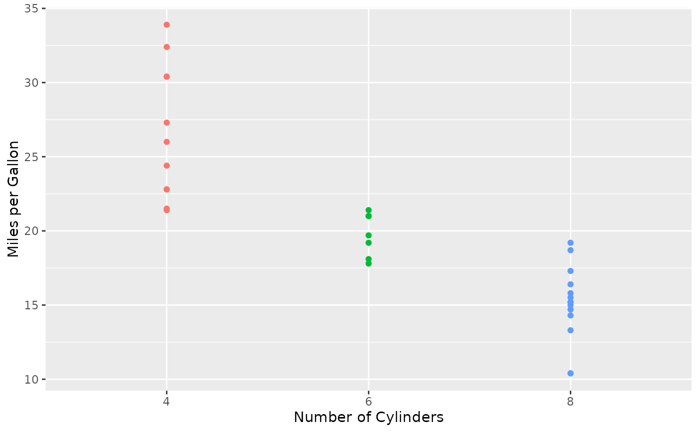
# Using the built-in data frame mtcars,
# plot miles per gallon vs. number of cylinders
# using different colors for each level of the number of cylinders.
#------------------------------------------------------------------
p <- ggplot(mtcars, aes(x = factor(cyl), y = mpg, color = factor(cyl))) +
theme(legend.position = "none")
p + geom_point() +
labs(x = "Number of Cylinders", y = "Miles per Gallon")
 # Now add the sample size for each level of cylinder.
#----------------------------------------------------
dev.new()
p + geom_point() +
stat_n_text() +
labs(x = "Number of Cylinders", y = "Miles per Gallon")
#==========
# Example 2:
# Repeat Example 1, but:
# 1) facet by transmission type,
# 2) make the size of the text smaller.
#--------------------------------------
dev.new()
p + geom_point() +
stat_n_text(size = 3) +
facet_wrap(~ am, labeller = label_both) +
labs(x = "Number of Cylinders", y = "Miles per Gallon")
#==========
# Example 3:
# Repeat Example 1, but specify the y-position for the text.
#-----------------------------------------------------------
dev.new()
p + geom_point() +
stat_n_text(y.pos = 5) +
labs(x = "Number of Cylinders", y = "Miles per Gallon")
#==========
# Example 4:
# Repeat Example 1, but show the sample size in a text box.
#----------------------------------------------------------
dev.new()
p + geom_point() +
stat_n_text(text.box = TRUE) +
labs(x = "Number of Cylinders", y = "Miles per Gallon")
#==========
# Example 5:
# Repeat Example 1, but use the color brown for the text.
#--------------------------------------------------------
dev.new()
p + geom_point() +
stat_n_text(color = "brown") +
labs(x = "Number of Cylinders", y = "Miles per Gallon")
#==========
# Example 6:
# Repeat Example 1, but:
# 1) use the same colors for the text that are used for each group,
# 2) use the bold monospaced font.
#------------------------------------------------------------------
mat <- ggplot_build(p)$data[[1]]
group <- mat[, "group"]
colors <- mat[match(1:max(group), group), "colour"]
dev.new()
p + geom_point() +
stat_n_text(color = colors, size = 5,
family = "mono", fontface = "bold") +
labs(x = "Number of Cylinders", y = "Miles per Gallon")
#==========
# Clean up
#---------
graphics.off()
rm(p, mat, group, colors)
# Now add the sample size for each level of cylinder.
#----------------------------------------------------
dev.new()
p + geom_point() +
stat_n_text() +
labs(x = "Number of Cylinders", y = "Miles per Gallon")
#==========
# Example 2:
# Repeat Example 1, but:
# 1) facet by transmission type,
# 2) make the size of the text smaller.
#--------------------------------------
dev.new()
p + geom_point() +
stat_n_text(size = 3) +
facet_wrap(~ am, labeller = label_both) +
labs(x = "Number of Cylinders", y = "Miles per Gallon")
#==========
# Example 3:
# Repeat Example 1, but specify the y-position for the text.
#-----------------------------------------------------------
dev.new()
p + geom_point() +
stat_n_text(y.pos = 5) +
labs(x = "Number of Cylinders", y = "Miles per Gallon")
#==========
# Example 4:
# Repeat Example 1, but show the sample size in a text box.
#----------------------------------------------------------
dev.new()
p + geom_point() +
stat_n_text(text.box = TRUE) +
labs(x = "Number of Cylinders", y = "Miles per Gallon")
#==========
# Example 5:
# Repeat Example 1, but use the color brown for the text.
#--------------------------------------------------------
dev.new()
p + geom_point() +
stat_n_text(color = "brown") +
labs(x = "Number of Cylinders", y = "Miles per Gallon")
#==========
# Example 6:
# Repeat Example 1, but:
# 1) use the same colors for the text that are used for each group,
# 2) use the bold monospaced font.
#------------------------------------------------------------------
mat <- ggplot_build(p)$data[[1]]
group <- mat[, "group"]
colors <- mat[match(1:max(group), group), "colour"]
dev.new()
p + geom_point() +
stat_n_text(color = colors, size = 5,
family = "mono", fontface = "bold") +
labs(x = "Number of Cylinders", y = "Miles per Gallon")
#==========
# Clean up
#---------
graphics.off()
rm(p, mat, group, colors)